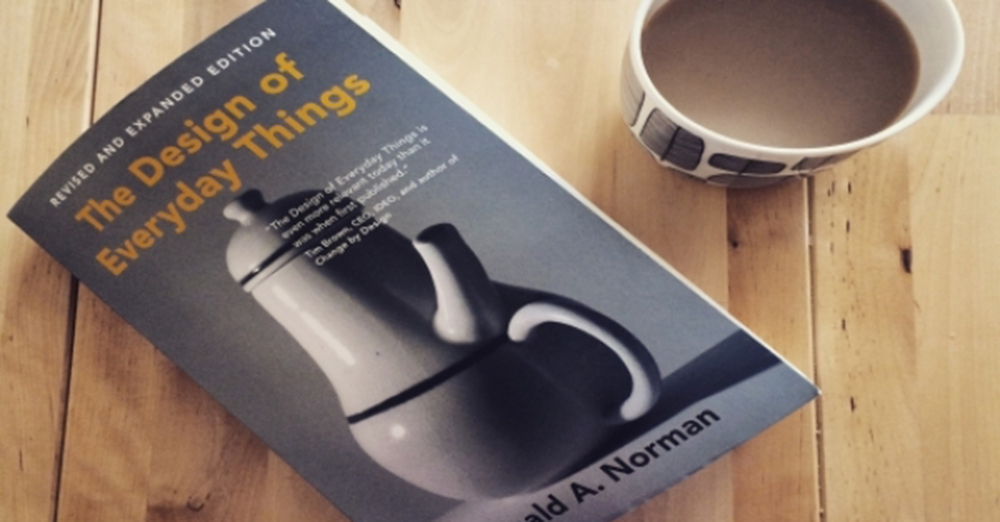
Don Norman, author of The Design for Everyday Things (DOET), describes the tragedy of an acquaintance trapped between six glass doors.
At a post office in a European city, six glass doors were lined up to keep out the cold air outside. The entrant has to open one card at a time. The idea is to cut off the airflow, as the front door is closed before opening one and the other.
The glass doors are double-sided. It also opens when pushed in from the outside. It also opens when pushed out. His acquaintance opened the door and entered. He went a little to the right as he went to open more doors. He pushed open the door. No It does not open. I pushed hard, but when it did not open, I thought the door was locked.
So I went back and tried to get out. He pushed open the door that had just been opened, but it did not open.
So he pushed again, even though he could get the door to the entrance. No
I’m stuck You cannot enter or exit. Imagine for a second you were transposed into the karmic-driven world of Earl.
At that moment, some people pushed open the glass door and entered. When he saw them push open the glass doors one by one, he knew in a hurry and entered.
what’s happened. Glass doors have two sides, just like ordinary hinged doors. There was a pole on one side and a bolt on the other. There is nothing on the other side. The door will open only if you push from that side. The door does not open when you push on the edge of the hinge. The same is true of the hinged doors of houses.
The door of the post office was accentuated, and the hinges and pillars were hidden from view. Beauty is more important than the door. The door did not open because Norman’s acquaintance reached the door and pushed the door open.
Good design has two important features. Discover and understand. Just do web design. These two features are important when it comes to mobile design. If visitors close between the glass doors, those people will turn their backs on it forever. The actual loss of return users is real.
Discoverable
It must be possible to figure out how to do it. Where to do it? You also need to be able to figure out when to do it.
Understanding
What does all this mean? What do you want them to do? How do you want it to be used? What will all the controls and settings do?
The old glass door is very beautiful. You could even win a design award. ၊ The missing glass door. An unknown door on the left. So it is failing to detect.
A device can be either a door or a door. Whether it is a mobile phone or a nuclear power plant, the components must be visible. You need to let them know what you need to know. How is that possible? Where and how should it be done? If the door to be pushed open must be shown where to push it. It must be shown. You do not have to ruin the beauty. You need to mount a flat plate so that the edge of the push is visible. Or make the pole visible. Then the person using the door will find and understand. You do not have to write on the screen.
If you have a complex and confusing device, you will need to write a user guide. You can do a variety of tasks, and if you have controls in place to customize them, you will need to write a user manual.
For simple everyday items like doors, you do not need to explain how to make a ton of letters. It must be designed so that it is not needed.
In the same way, you need to make sure that you know how to use your website or mobile app on a daily basis. It’s best to be able to use it on your own without being explained.


