
Font style is important for UI web design, but it is not always important.
In fact, typography always needs to be considered.
Of course, web design is not the only thing that matters. Letters are important in every visual expression. Even if you are not a designer, it would not be wrong for you to know about this font store. This is because once the text is included in the design, the font style becomes more or less important.
For fans of Myanmar ICT Guide, I will focus on the UI (user interface) design of the website.
The font style is quite subtle. So, they are not being ignored. They work on the principle that if they can read, they are done.
Does it really matter?
Let me ask you a simple question.
What is the purpose of a website or app? Isn’t it to pass on what you want to convey? Is it just a matter of placing such information in a frame? Isn’t it the purpose of the UI designers to organize each piece of information they want to convey and display in a meaningful way?
Words and text are talking to the viewer.
What if the user does not add the message saying that they know it?
Let’s take a look at an example of a website without text.
You can’t play too much with the words that the viewer is communicating to the user.
Pictures can play with light and dark. You can play with colors. If you play with words like that, the reader will be dizzy.
So it’s easy to do because there is not much play. It is not easy to be effective typography.
There are four main points that can be made to play when designing text.
1. Typeface
2. Font Thickness Weight
3. Tracking (Words spacing)
4. Leading (Line spacing)
In order for a custom UI to be professional, you need to consider these four key factors in order to stand out.
1. Typefaces know the fonts
Choosing the right font is crucial to whether or not the design you are working on will work.
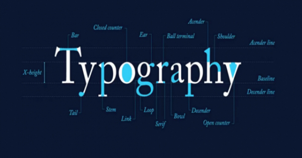
It does not work with a single font. So we use fonts together. From experience, you may know which fonts work best for you. You may even know it in your mind. You may also find it copied from other websites. He must have been well-educated and well-educated. When choosing to pair fonts, it is important to note that the selection must be based on the x-height.
If you want to learn more, you can learn more about Google Fonts at https://fontpair.co. FONT RECOMMENDATIONS & LISTS suggestions for matching fonts are also available at https://www.typewolf.com/
To view and choose fonts styles, go to https://www.fonts.com/browse
2. Font Thickness Weight
It is important to understand the depth.
The first rule is
Do not use more than two or three different fonts.
Fonts have a variety of family fonts, so you do not need to include all of them. Only two or three types should be used.
Use one for normal.
The other one will be used for the title.
The other one will be used for the headband.
The second rule is
I chose more than one thickness.
Use regularly for the paragraph. Skip the medium for the title without using it. I will use a semibold. For larger headers, use heavy overbold.
Remember that the goal is to be visually heavy. How to make it different from other texts So in addition to the difference in thickness, you also need to push with more space around the bottom than the color difference.
The third rule is
Do not choose too dark or too thick.
Do not choose too thin as a hair.
You should avoid using Hairline text while browsing the website. And most fonts do not have a thin hailline print. So the choices are limited.
When it gets dark, it will take up too much space. And it can be disgraceful. Therefore, we urge you to avoid the two extremes of hairline and blackheads.
3. Tracking (Words spacing)
There is a difference between tracking and Kering.
Tracking is about spelling.
Kering refers to the space between the letters in a word.
When writing fonts, Kerning is already included for every letter. But you can do it if you want to make concessions. this
But never do it. It is best to keep it as it is.
So just play tracking.
If you choose a font, play tracking. Some fonts take up a lot of space on the side. So draw a word with tracking.
You can add up to four or five more characters in the space provided by tracking. In some cases, changing the font type makes the text more elongated. For example, condensed fonts and Narrow fonts have been changed.
4. Leading (Line spacing)
You need to pay attention to leading on web pages that display a lot of text.
The rule is that for headings, the leading should be reduced. Prioritize paragraphs that use fewer capital letters, such as the title. It must be sown. Let’s say you use a font size of 72 for the header, it will be quite a gap between the two lines below. So, if you reduce it, it will look slimmer.
Once you have organized the content, take a look at the whole thing. Is there unity? Are the sentences okay? Are the components balanced? Is it running smoothly? Are there any congested areas? The paragraph breaks really are important for readability, but there is a lot of room for improvement. In this case, reduce the gap between the paragraphs by scattering the leading in the paragraph and playing with the paragraph spacing.
If you have large headings, you need to create spaces on the side. Then the title will be separate and appointed. Did you deliberately fill in the blanks?
